Joanna Boehnert
On the Internet ‘big data’ is popularized by data visualisation (datavis) that makes raw data accessible and meaningful to wider audiences. Here big data is harnessed to address society’s problems by illustrating trends and debunking assumptions that contradict the data. Despite the value of this work, the process of collecting and visualising data is never entirely neutral and never complete and so data visualization cannot capture every relevant fact. Something will always be missing. Data visualizations conceal more complicated realities. The decision to collect data and how this data is represented all reflect ideological assumptions and often unstated political agendas. Data displays embody values. These are reflected in which data is selected, as well as the methods, media and styles used to communicate information. Big data driven data visualisation on highly complex and political issues all too often result in a reduction of the complexity and a flattening out of phenomenon to what can be captured with numbers. Purely quantitative approaches to data visualization driven by big data are inadequate on politicised issues as they typically fail to capture power relations, ideology, attitudes and behaviors that cannot be reduced to a number.
Data visualizations by statisticians do the work of simplifying complex issues by reducing what is measured and communicated to just a few factors most efficiently. With this highly popular work, ideological agendas are served discretely and buttressed with what appears to be hard facts. I will use Max Roser’s work featured on his website OurWorldinData.org as an example of how metrics and communication methods engage with highly politicized issues uncritically and make generalizations that support the interests of power. Similar problems are evident in a range of work produced by statisticians making data visualizations. Roser’s work is popular online because it offers overviews of topics and trends. These data visualisations obscure complex problems and in some instances are severely misleading.
Data visualizations are routinely rolled out to prove that ‘we have never had it so good’, supporting the interests that rely on this discourse. Roser recently presented his work on this topic ‘How does the world today compare to 1957?’ at the Oxford Martin School at the University of Oxford. This highly ideological work presents society as progressing towards greater equality, justice and freedom. In order to present this perspective, this discourse needs to ignore crippling new types of poverty, severe environmental concerns and the emerging authoritarian nature of neoliberal modes of governance. Big data is a powerful tool in flatting out the complexity of politicized issues to make it appear that the concerns raised by justice campaigners are inconsequential relative to the supposedly upward trend in so many data sets as visualized and oversimplified by statisticians such as Roser.
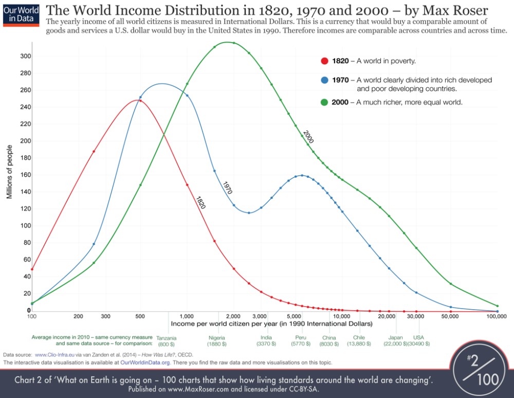
For example, the assumptions evident in ‘The World Income Distribution in 1820, 1970 and 2000’ are not nearly as clear as the graphic displays. Roser tweeted “If I could only show one graph on the economic history of the world, it would be this one” (@MaxCRoser, May 13, 2015). Here 1820 is described as ‘a world in poverty’ but what this graph fails to capture is that prosperity can be measured in very different ways and the poverty that Roser describes in 1820 is very different from the poverty of today. This data flattens out important factors about how economic activity is valued and how prosperity and wellbeing is measured. For example, in the past more economic transactions were outside the market. People were self-sufficient in ways that are now mostly lost. People clearly had less income but not necessarily a lower standard of living. Working class and peasant movements resisted enclosures that destroyed their autonomy, evicted them from land and forced them into factories and urban slums for well over two hundred years. Summarizing 2000 as ‘a much richer, more equal world’ assumes that financialised income is equivalent to wealth. This is a false equivalence. This perspective ignores dynamics such as land-grabbing, evictions, slums and new types of poverty created by industrialization. It hides the fact that today poverty is constructed. Depicting the poor as more prosperous because they have some financial capital obscures the work of justice movements. Describing 1970 as ‘unequal’ relative to 2000 is untrue in many places in the world, including in most of North America where the middle classes has been eviscerated in this time period and polarizations of wealth are well documented.
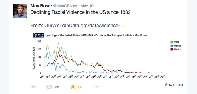
Roser tweeted “Declining Racial Violence in the US since 1882” (@MaxCRoser, May 10 2015) and embedded a graphic about the decreasing number of lynchings in the United States into the tweet. This work serves the narrative that racism is being effectively addressed in America. If this were true why are thousands of people on the streets of Ferguson, Baltimore and most other major cities in America focusing attention on the prolific racial violence evident in police killings of black and brown people? Roser’s claims about racial violence in the USA are untrue. He needs to include police and other types of race violence in his data sets.
Representations of the environment are also highly politicized and here Roser’s data visualisations severely misrepresent supposed progress with environmental issues. In ‘How does the world today compare to 1957?’ Roser presents two charts on issues of the environment. The first ‘Global death rate from natural catastrophes (1900-2013)’ demonstrates the significant improvements in humankind’s capacity to survive catastrophes. Roser’s data here is probably accurate if the approach to data collection is very narrow in its boundary conditions. Considering the current refugee crisis with millions of people leaving places where environmental circumstances have deteriorated, exactly how survival is defined in the wake of natural disasters must also be a contested issue. While the data could prove that there are more survivors per capita in the short or immediate term, more extreme weather events are happening. The impact of extreme weather is a point of contention at yearly United Nations climate conferences. Nations on the frontline of climate change impacts fiercely contest the narrative that natural catastrophes are less of a problem now than in the past.
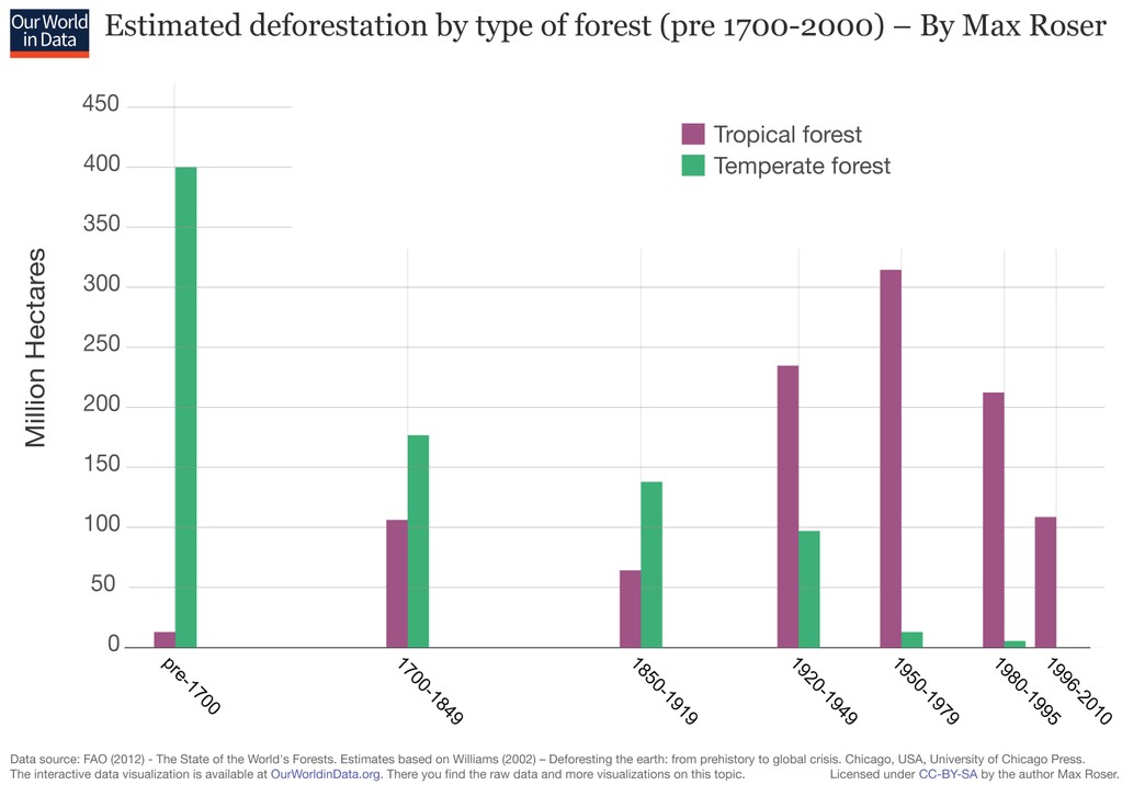
The other chart in the environmental section is titled: ‘Estimated deforestation by type of forest (pre 1700-2000)’. This graph shows the decrease in temperate forest deforestation. This would appear to be a positive trend if it were not for the facts that: 1) in the UK and in much of Europe these forests were cut down over several centuries, they are already gone, so they cannot be recut and 2) environmental harms including deforestation are now, in an era of globalization, exported to less powerful countries in the Global South and so it is tropical forests that are currently the most severely deforested. Considering that 80% of global forests have already been destroyed Roser’s suggestions that we are making environmental progress with regard to deforestation is wildly untrue and entirely de-contextualized. This work is deeply unhelpful to environmental movements that are struggling to save remaining forests. Hundreds of environmental activists have died over recent years while attempting to protect forests and other natural spaces. Meanwhile statisticians produce de-contextualized and over-simplistic analysis to greenwash (datawash?) environmental circumstances.
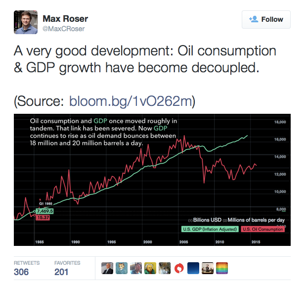
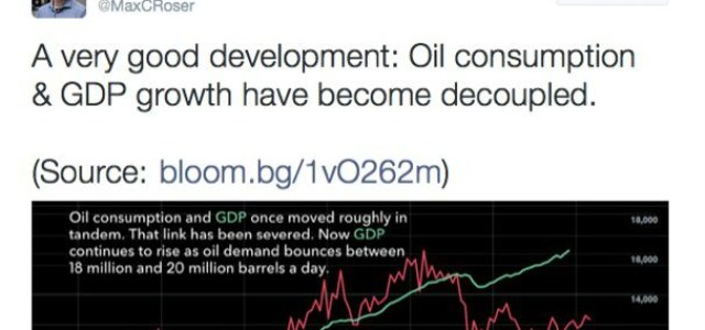
Finally, Roser tweeted “A very good development: Oil consumption & GDP growth have become decoupled.” (@MaxCRoser, May 11, 2015). This positive vision was highly popular and received 305 retweets 201 favorites. While this is not Roser’s work, it reproduces the faulty assumption common in his own work. Here is a chart claiming US oil consumption and GDP growth have been decoupled. Again, excellent news until we remember that: 1) gas has replaced oil as the primary fossil fuel driving GDP growth and 2) that much of the US energy use has been exported to the nations that produce the things Americans consume. The impact of embedded energy emissions needs to be considered before we start congratulating America for its success in decoupling fossil fuel energy use from GNP. Energy issues are complex. Over-simplifying the data and the narrative seriously damages public understanding of these issues and erodes capacity to build effective responses to social and environmental problems.
Displays of empirical data on highly politicized issues must be approached from a critical perspective. Information visualization guru Edward Tufte states that ‘excellence in presenting information requires mastering the craft of spurning ideology’ – but all communication embodies ideology whether one is aware of one’s own ideological premises or not. In many cases, the most relevant and important fact is that certain groups have more power to create representations than others. With an understanding of the politics of representation, truth-seeking data visualizations must move beyond the presentation of big data as the foundation for analysis. This is especially true for politically loaded environmental issues. Obviously quantitative data displays have value – but power and ideology hide behind the presentation of ‘big data’ such that some interests are presented and others are obscured. An awareness of the limits of data visualisation opens space for more truthful information visualizations. Only with this awareness can we move towards creating knowledge rather than de-contextualized over-simplified datawash serving a highly ideological function while appearing to deliver only the facts.
Joanna Boehnert is finishing work her first book titled Design/ Ecology/ Politics: Within and Beyond Error for Bloomsbury Academic. She a visual communication design theorist and practitioner who specializes in environmental communication. She completed an Arts and Humanities Research Council funded PhD in 2012 at the University of Brighton and is founding director of EcoLabs.