John Hills, London School of Economics [pdf]
Most people don’t think everyone should have the same wealth as everyone else. After all, some choose to save and some to spend. Older households have had more time to save up than younger ones. Some are lucky and some unlucky. Figure 1 shows how people thought wealth ought to be shared out when they were asked in an Ipsos MORI poll for the University of Birmingham Wealth Commission in September 2013.
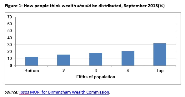
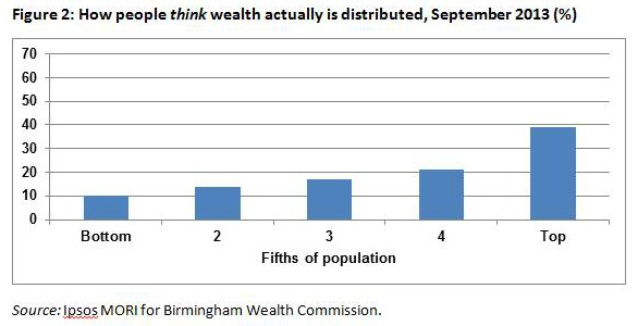
On average they thought that the wealthiest fifth ought to have about a third of the total, but the poorest only 13 per cent, and the others something in between. But they did not think it was really like that, as Figure 2 shows. They thought the bottom tenth probably only had 10 per cent of the total and the top tenth nearly four times as much.
But their guesses were still a long way from reality. The best and most recent picture of the distribution of wealth in Great Britain is given by the Office for National Statistics’ Wealth and Assets Survey, covering the period from July 2008 to June 2010. These figures give an average for the period starting just as the financial and economic crisis began when, in particular, house prices were at a peak, but subsequently fell. The value of financial assets also fell considerably in the middle of this period, but had largely recovered their values by 2010, as measured by the performance of stock markets, at least.
What this shows – adding in all kinds of wealth from personal possession and cars, houses and savings to the value of people’s pension rights – is in Figure 3. This shows how the ONS’s estimated total of £10 trillion of household wealth is actually split across the population from the least wealthy to the most wealthy fifths.
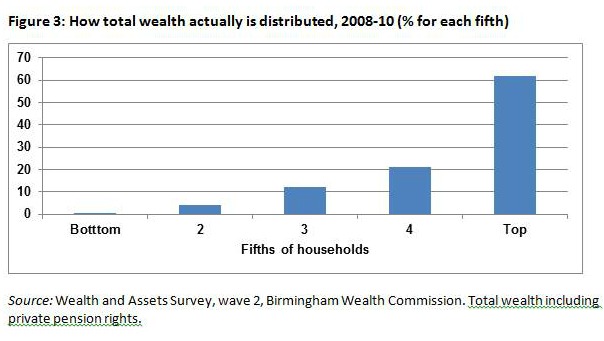
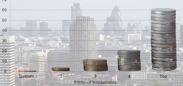
The bottom fifth in fact has hardly any wealth to speak of – less than a tenth of a per cent of the total. Some have ‘negative wealth’ – debts that outweigh their assets, even including personal possessions. The next fifth doesn’t have much either – just 4 per cent of it. But the top fifth have 62 per cent – half as much again as people think and nearly double what they say they think is fair.[1]
What the distribution of wealth actually looks like
It turns out then that most of us do not have a very accurate idea of how much wealth other people have. This article presents a more detailed picture of what wealth inequality in Britain looks like and how it relates to people’s age, housing tenure, and occupational social class, using results from the ONS’s Wealth and Asset Survey for 2008-2010.
The very richest households may not be captured by a survey of this kind. For instance, the figure for wealth of the top 1 per cent from the Wealth and Assets Survey suggests that the richest 240,000 British households had total wealth of around £1,270 billion between them in 2008-10. Other sources attempt to analyse the wealth of the very richest. The annual Sunday Times Rich List [2] suggests that the richest 200 families they identified had between them aggregate wealth averaging £225 billion between 2008 and 2010, an average of more than £1 billion each,about 2.2 per cent of the national aggregate, and equivalent to a sixth of the share of the whole top 1 per cent covered by the ONS survey. While such figures are hard to verify, and the eligible population for inclusion in this list will not necessarily coincide with ONS’s criteria, they do suggest that there is considerable inequality within the very wealthy group itself.
The ONS survey looks at the value of the total wealth of each household taken as a whole. It does not adjust these figures for the size of different households or allow for the way in which some household members may ultimately have more control over their wealth than others. The distribution of wealth between individuals may be even more unequal than that between households – and indeed other data sources suggest that it is – but other household members may also benefit from one-another’s wealth, so assuming no pooling of resources like this is probably as unrealistic as looking at households together, implicitly assuming that they do operate as a unit.
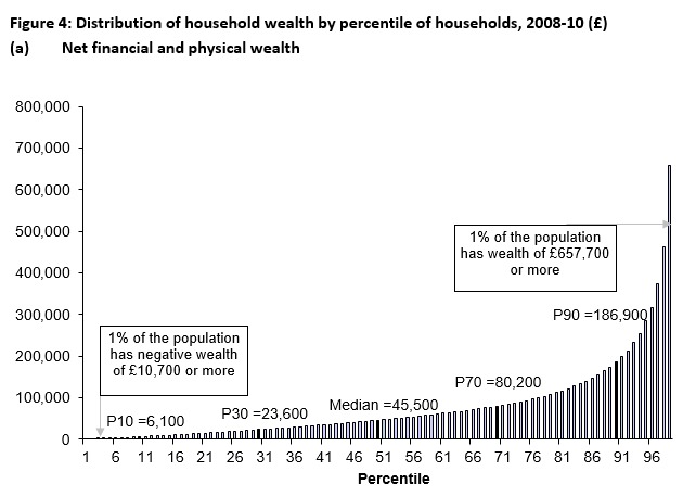
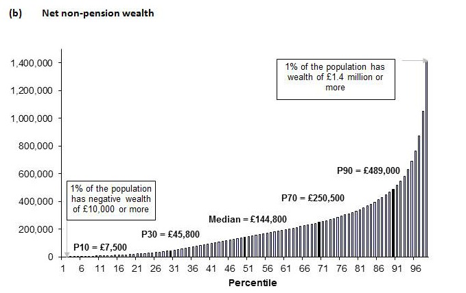
A more detailed impression of the shape of the household wealth distribution is given by Figure 4 (a-c). This shows the values of wealth within the ONS survey defined in three different ways:
- Net financial and physical wealth (which includes items such as consumer durables and cars, as well as financial assets such as current and savings accounts, deducting non-mortgage debt);
- Non-pension wealth (which adds in property, net of mortgages); and
- Total wealth (which adds in estimates of the value of people’s private pension rights, as in Figure 3).
The height of the bars in the figures show the value of wealth on each definition at each percentile,[3] giving what is sometimes called the ‘Pen’s parade’ presentation (after the Dutch economist, Jan Pen (1971), who imagined that the population had their heights adjusted in proportion to their incomes, and then marched past the observer in a ‘parade of dwarfs and a few giants’).
Some households had little or no wealth or even negative wealth (that is, those whose liabilities exceed their assets, even when household goods and property like cars are included – the data relate to the period starting just before house prices fell, so ‘negative equity’, which could also create negative non-pension wealth, may become more common in later periods. Values of housing are those reported by owners, who may not have fully adjusted their estimated values to market prices). On the narrowest wealth definition shown in Figure 4(a), more than 2 per cent of households had no or negative wealth in 2008-10. A tenth of households had less than £6,100 (the 10th percentile). Half had wealth above £45,500 (the median level), and ten per cent more than £186,900 (the 90th percentile). One per cent of households had net financial and physical wealth of more than £657,000.
Adding in houses and mortgages, to show net non-pension wealth as in Figure 4(b) (on an extended vertical scale), 2 per cent still had zero or negative wealth, but the median rose to £144,800, and the 90th percentile to £489,000. More than 2 per cent of households had net non-pension wealth exceeding £1 million; for the top 1 per cent it exceeded £1.4 million.
Allowing for private pension rights as in Figure 4(c) (again on a larger vertical scale) widens the gaps again, particularly at the top. Just under 2 per cent of households had zero or negative total net wealth, and the 10th percentile for total wealth only rose to £12,600 and the median to £232,400. However, a tenth of households had total wealth exceeding £967,200, nine per cent more than £1 million, and the top 1 per cent more than £2.8 million.
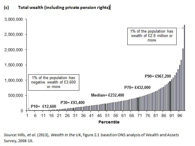
The overall share of the top tenth in total wealth was 850 times the share of the bottom tenth. Even the least wealthy of the top tenth had 75 times the wealth of the household just at the top of the poorest tenth. In all, the top 1 per cent had 14 per cent of the total, and their average wealth was more than £5 million.
Wealth and age
One obvious objection to these figures for all households as a measure of wealth inequality is that for many people, wealth follows a life cycle pattern. We would expect young people, forming a household for the first time to have low wealth. In the absence of inheritances or gifts, they would not have had time to build up savings, buy equity in a house, or build up pension rights. Similarly, the oldest households would be expected to have run down their savings, possibly to have ‘traded down’ any property they owned, and would have less valuable pension rights. It would be those immediately before retirement who would be expected to have the highest wealth. This life cycle savings pattern would mean that a snapshot of wealth would always look unequal, even if there were few differences between people of any given age.
Figure 5, also drawn from WAS data for 2008-10,[4] confirms that there are substantial differences in wealth between age groups, with those households aged 55-64 indeed having the highest wealth, with a median of £431,000 (marked by the black cross on that bar) – nearly twice the median for all households of £235,000. But households aged 25-34 had median wealth of only £76,000.
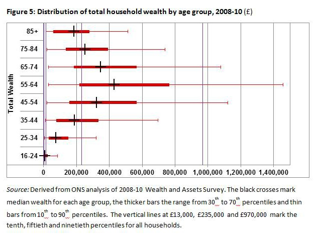
It is worth thinking of the implications of this difference for a moment. If a typical younger household was to make up the difference to reach the current position of the older ones by the time they were the same age just by saving, that would mean somehow or another putting aside £11,800 each year (or a bit less if their savings built up through interest and so on). But that is approaching half of median full-time earnings, before tax, every year for thirty years.
This seems an unlikely proposition for most. It does not mean that the younger generation cannot catch up with the ‘baby boomers’. Over the next thirty years, wealthier parents will help their children get onto the housing ladder, grandparents will die and leave their wealth to their children, parts of that filtering down to grandchildren. But this will be a highly unequal process – depending on who people’s parents and grandparents are, where they live, and who they choose to favour.
This inequality reflects the other main issue shown in Figure 5. It shows that there is considerable inequality within each age group, indeed almost as much as within the population as a whole. The ends of each narrow line in the diagram show the 10th and 90th percentiles for wealth within each age group. For instance, a tenth of households aged 55-64 had total wealth – all of the resources with which they face retirement, apart from state pensions and other benefits – below £29,000, but a tenth had wealth above £1.46 million. This ‘90:10 ratio’ of fifty to one may not be as large as the seventy-five to one for the population as a whole at the time, but is still very considerable by any other standard (even ignoring the hyper-rich of the Rich List). Overall wealth inequality plainly is not just a matter of life cycle savings effects.
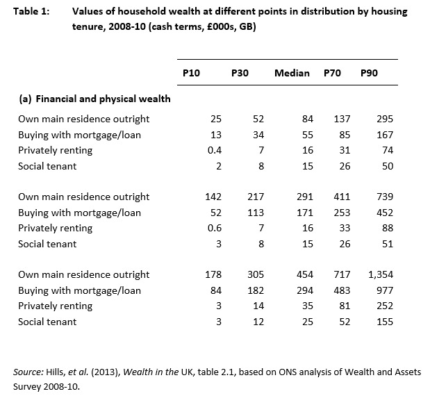
Wealth and housing tenure
Given the importance of housing within total wealth, it is not surprising that some of the biggest differences come when households are compared depending on their housing tenure. But Table 1 shows that there are equally large differences within other components of wealth which reinforce this. In 2008-10, social tenants had median financial and physical wealth of £15,000, which was unchanged allowing for housing, as one would expect. But this rose only to £25,000 when non-state pension rights were allowed for. By contrast, households owning their house outright had median financial and physical wealth of £84,000, rising to £292,000 including housing, and £455,000 including private pension rights. A tenth of outright owners had total wealth of more than £1.3 million, while the 90th percentile for social tenants was only £158,000. A tenth of social tenants had total wealth below £3,000 – even including personal possessions such as clothes and furniture.
Wealth, age and social class
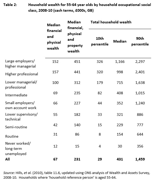
The differences in wealth accumulated by the time people near retirement are a product of a series of processes related to their incomes through their working lives. While we do not have information on wealth classified by the income people have had through their working lives, these are closely related to their occupational social class. Table 2 shows wealth differentials by household social class just for those aged 55-64.
As can be seen, the differences are considerable, even abstracting, as this data does, from life-cycle savings effects. The median total wealth of the top two groups was more than £1 million. For the bottom three groups it was less than £230,000. For the top two groups, private pension rights added £715,000 and £560,000 to the medians respectively. For the bottom three groups they contributed £90,000 or less (just £15,000 for the bottom group). Looking just at financial and physical wealth (excluding houses and mortgages), the top two groups had median assets of around £150,000, while the bottom three groups had less than £42,000.
There are, however, again considerable differences in total wealth within the social class groupings. A tenth of those in the top two groups had household wealth of more than £2.3 million at this age, but a tenth of higher professionals had less than £320,000. A tenth of those in routine occupations had wealth of over £640,000, but a tenth were approaching retirement with less than £8,000.
Conclusion
Most discussion of public policy, the welfare state and inequality focuses around differences in income – how great is the gap between the well-paid and low-paid; how do benefits out of work compare with after tax income in work; how much more can higher-income parents do for their children than lower-income ones?
But inequalities in wealth between households are in many ways a bigger issue. Over the last two decades personal wealth has become a much bigger multiple of personal incomes than it was. Even ignoring their considerable pension rights, half of households aged 55-64 have wealth of more than £230,000 – the equivalent of having saved up every penny of typical household income for nearly ten years.
That in itself raises huge issues about the differences between generations, with implications running from whether student loans are fair to how we should pay for pensions and long term care. But the huge differences within each generation raise questions that are as large. What, for instance, would need to be done to create the ‘equality of opportunity’, that politicians from nearly every part of the spectrum subscribe to, when there are such colossal differences in the resources that may be mobilised to help from parents and grandparents?
John Hills is Professor of Social Policy and Director of Centre for Analysis of Social Exclusion (CASE), London School of Economics.This paper is based on parts of Chapter 2 of Wealth in the UK: Distribution, accumulation and policy by John Hills, Francesca Bastagli, Frank Cowell, Howard Glennerster, Eleni Karagiannaki and Abigail McKnight (Oxford University Press, 2013). The research behind the book was supported by the Nuffield Foundation and the Economic and Social Research Council (grant RES-051-27-0234). Further information and a summary of the book can be found here. The book is available from Oxford Scholarship Online.
[1] For a video describing similar survey results, see http://youtu.be/aOJ93tAbPP0.
[2] Published with the Sunday Times, May 2012. The definitions used for the list can include family members who are not living together, which would be a wider group than used by WAS, for instance. Its coverage of business assets may be better than in the household surveys, although it will not have such good coverage of items such as pension rights and household goods.
[3] One per cent of households have wealth below the first percentile, 2 per cent below the second percentile, and so on, up to 99 per cent of households being below the 99th percentile.
[4] J. Hills, J. Cunliffe, L. Gambaro and P. Obolenskaya (2013), Winners and Losers in the Crisis: The changing anatomy of economic inequality in the UK 2007-2010, Social Policy in a Cold Climate Research Report 2, CASE, London School of Economics, figure 8.2. Available at: http://sticerd.lse.ac.uk/dps/case/spcc/rr02.pdf